
Web design news.
Envato Tuts+ Tutorials made available the next content. They frequently provide you with info of the highest quality and therefore are considered one of my favorite must-follow blogs. You are going to get something out of it.

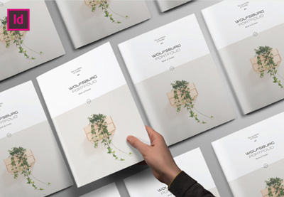
In this tutorial, we’ll create a clean, stylish InDesign portfolio template, suitable for architectural work, with lots of emphasis on imagery and geometry. These concepts will also apply to a variety of brochure design scenarios. So grab your favorite portfolio pieces, and let’s dig right in.
What You Will Need
You will need the following assets in order to complete this project:
- Modern Architecture Image
- Modern Architecture Image 2
- Modern Architecture Image 3
- Preface Sans Serif Typeface
Now, let’s get started!
1. How to Start Our Project
Step 1
First, let’s start up a New Document. We’ll need to decide the orientation and dimensions of our portfolio template.
Portfolios are particularly fun to design, because you often have a lot of freedom to decide on the best way to feature your work. You might choose to go with something traditional, or maybe you’ll go with a square shape or even a long format. Consider your options and what might be the best way to present your work.
In this example, we’re going to work in a square format, 10″ Wide by 10″ High.

Step 2
Before we finalize our document setup, let’s address a few additional attributes.
I set my Margins to 0.5″ on the Top, Bottom, and Outside. On the Inside, I set my Margins to 0.75″, just a little extra, to accommodate the space that may be lost between my pages.

Step 3
I also wanted to add a 0.125″ Bleed to my document.
If an image is “Full Bleed”, it generally means that the imagery/content goes to the edge of the page, without any border or “white space”. If we want something to be full bleed, we often have to extend our work to the bleed area, to allow for trimming when our work is printed and prepared.
Once you’re happy with your settings, click Create to accept and start up your document.
If you’ve made a mistake or you change your mind, don’t worry—you can always go back and change these settings via File > Document Setup.

2. How to Create Our Interior
Step 1
Let’s start creating our portfolio interior within a Master Page.
Master Pages are often used as a template of sorts—we can apply elements that we lay out in our Master Pages to the Active Pages in our document.
Master Pages are located within the top portion of the Pages panel. If you don’t see the Pages panel, you can open it up via Window > Pages.

Step 2
Go “inside” of A-Master, our first Master Page, by double-clicking on it. That’s where we’ll start laying out our composition.
Portfolio pages essentially need to show off our work—there needs to be an emphasis on the portfolio piece itself. However, we also want to do so in a visually engaging and interesting way.
Before I started placing imagery, I decided to “block out” my composition with gray rectangles, using the Rectangle Tool. The Fill is set to 25% gray. I find this to be a simple way to experiment with your composition or create a thumbnail.

Step 3
Once I had some rectangles placed, I created Guides, based on my layout elements. To do so, Click and Drag from the Document Rulers at the sides of your document.
These Guides are inspired by the gray rectangles I placed.

Step 4
Next, I started placing text based on the Guides I had created. Use the Text Tool to place text.
Keep in mind the text that you’d want featured in your portfolio. It’s generally a good idea to have the title of the piece, the date it was created, and a description. You might also want an artist’s statement of some kind, to further explain your process or intention.
Let’s start with our title. In terms of hierarchy, it should likely be the text with the most visual importance—so I’d like it to be rather large on the page.

Step 5
I decided to add supplemental text, under the title, using the Text Tool. This felt like a great place to have key information that the viewer would need to know right away—like a brief description of what it is and the date of creation.
Again, think about hierarchy. This is more supplemental type, so I made it smaller.

Step 6
Now, let’s add two spaces for some more supplemental type—this could be a great place for additional comments, insights, or statements on the work. Again, use the Text Tool. I wanted this type to be the smallest, because it is meant to be the most supplemental—it’s our body copy.

Step 7
To push the aesthetic further, I decided to add some lines using the Line Tool. Note that they are inspired by the existing layout elements.
The Guides, in the example below, have been Hidden (via View > Grids and Guides > Hide Guides) so it’s easier to see the lines.

Step 8
The footer area could include any supplemental information you like. In the case of my composition, I decided I wanted to stick with page numbers.
To insert page numbers, first create a Text Box using the Text Tool.
Then, go to Type > Insert Special Character > Markers > Current Page Number.
You’ll notice that they read “A”—this is OK! Remember, we’re working in A-Master, a Master Page, so that technically is the page number.
I decided to make my page numbers large, but a light gray, so their low contrast helps keep them supplemental in the hierarchy.

Step 9
Finally, let’s insert some imagery. Select the Rectangle Frame that you want to place your imagery into. Then, go to File > Place, and select your image.
Double-click on the Rectangle Frame to toggle between selecting the frame itself and the contents inside it. You’ll know you’ve selected the contents when the border around it is in red.
Resize and adjust your imagery until you’re happy with how it’s cropped.

Step 10
Repeat this process for your other rectangle frames. You could use these spaces for close-ups or other shots of your work.

3. How to Apply Our Master Pages
Step 1
Now that we’ve created a layout within a Master Page, let’s apply our Master Pages to our Active Pages.
First, Create New Pages. Let’s make sure we have three pages in our Pages panel. Click on the New Page icon in the Pages panel to create a new page.

Step 2
Notice that your pages have an “A” Icon on them. This means they are derived from our A-Master Page.
To further illustrate this idea, select the first page in your document. Then Select [None] in your list of Master Pages and drag it to your active page. You’ll notice that it goes blank—because, now, it isn’t derived from any Master Page.

Step 3
Let’s go to Page 2 and 3 of our document. You’ll notice that these two pages are derived from A-Master Page.
However, when you try to click on parts of your layout, nothing will happen. It’s all locked up.
To make edits locally, within individual pages, hold down Shift-Command (on Mac) or Shift-Control (on PC) while clicking on an element of your layout. This will make it editable.

Step 4
Let’s test this premise out by inserting new portfolio imagery into pages 4 and 5 of our portfolio.
First, create two New Pages.

Step 5
Then, select the image areas by holding down Shift-Command (on Mac) or Shift-Control (on PC) while clicking.
Double-Click to select the contents of the Rectangle Frame and Delete it.
Remember, we’re deleting the contents here—not the frame itself!

Step 6
Now, let’s insert our imagery. Select the rectangular frame. Go to File > Place, and then select your image file.
Now, you should have a new image in this rectangular frame—the one from our template has been replaced.

Step 7
Repeat this process in the other image areas in your layout. You could use the same image, close-up shots, or a different, applicable supplement here. Again, it’s up to you and what’s best for your portfolio presentation.

4. How to Create a Cover
Step 1
Now that we’ve created our interior pages and practiced editing them for different portfolio pieces, let’s make a cover for our work.
Before we begin, just a note—make sure to ask your printer about any questions or file requirements that might apply to your project. For example, your cover will vary from your interior, as it has a spine. Adapt your composition as needed.
Let’s start by creating a New Master Page. It should be called B-Master, and it will likely appear as a two-page spread by default.

Step 2
Delete one of the pages in B-Master, so you’re left with a one-page spread. This is going to be our front cover.
I wanted the front cover to feature some compelling imagery. A cover often has to compel the reader to open the book up—so it’s time to shine!
Place the imagery by going File > Place. Adjust the rectangle frame and Crop your work as desired.

Step 3
Then, I added a rectangle frame on top of the imagery with a White Fill.
To add transparency, select the rectangle frame and Right Click (on PC) or Control Click (on Mac). From the resulting dropdown menu, select Effects > Transparency.
I set my Transparency to 90%.

Step 4
Next, I added some type using the Text Tool and a line using the Line Tool.
You could place any type here that you find most appropriate—but feel free to follow my example on this! Remember, there’s no wrong answer—you know what’s best for your work! This is your time to shine.

Step 5
I decided I wanted the back cover to be more supplemental.
Create another New Master Page for the back cover. This one will be called C-Master.
Again, delete one of the pages in C-Master, so we have a one-page spread.

Step 6
Since this is the back of the booklet, I placed an image but left it small, and reused the contact info from the front cover, using the Text Tool.
My goal was to create something supplemental yet uniform with the rest of the book.

Step 7
Now, just like with our other Master Pages, we can apply B-Master and C-Master by clicking and dragging them to an active page.
Create a New Page, so our document ends with Page 6.
Page 1 and Page 6 are single pages—apply the front and back cover to these pages.

5. How to Use Your Template
Step 1
Now that we’re wrapping up our template, how do we use it?
You could save your work as an InDesign File (or indd file), but you could also save it as an InDesign Template file (or indt file).
When you go to save your work (by going File > Save), you can find these options under Format.

Step 2
What’s the difference? Unlike a “standard” InDesign file, an InDesign Template file can either be opened as an “original” (where you edit the template itself) or as a copy—where a new, untitled document is opened, based on your template.
See how that could come in handy?

And There You Have It!
Thanks so much for joining me on this InDesign portfolio walkthrough! Hopefully, you have some extra insight into how to create a portfolio or how to make a brochure design. I hope you found these techniques helpful—good luck with your portfolio, and your creative projects!

Looking for some extra inspiration, or even some extra help? Check out these InDesign templates—they’re ready to go, and they could make a great addition to anyone’s collection. Brochure templates can prove to be really versatile, too!
Architecture Portfolio Template InDesign
With 20 different pages, this InDesign template is not only a great fit for architectural work—its clean design could work for a multitude of varied projects, from illustration to graphic design. Check it out!

InDesign Architecture Magazine Template
This beautiful, stylish magazine layout could be easily adapted for your portfolio or other print project. If you’re looking for layout inspiration or a jump start on your project, this could fit the bill.

Portfolio Template InDesign
I love the long, horizontal orientation featured in this portfolio booklet. There’s so much space here to showcase your work in a clean and well-organized way. As far as InDesign brochure templates go, this one is a winner.

Architecture InDesign Brochure Template
Warm colors, transparencies, and clean design—this template is ready to use. Just drop in your content, and you’re ready to go—or use it as a springboard for a new take on this composition.

InDesign Portfolio Template
I love all the negative space in this portfolio design! It’s a classy, timeless look that would suit almost any kind of work—architectural or not! It’s large format, at 8.5″ x 11″, and includes 16 different pages.

If you enjoyed this tutorial, here are some others to check out!
-
 InDesign TemplatesHow to Make Stylish Layouts for a Portfolio Template in InDesign
 -
Brochure23 Creative InDesign Portfolio Templates (Best for 2019)
-
PortfoliosHow to Make a Portfolio Brochure Template in InDesign
-
PhotographyHow to Make an Attractive PDF Photography Portfolio


First seen here: Envato Tuts+ Tutorials
Trust you valued the info that they shared. You can find quite similar blogposts on our main website: https://www.designmysite1st.com/
Let us have your feedback down below, share a quick comment and let us know which things you want us to cover in up coming posts.