
Web design new & views.
All new article introduced courtesy of Envato Tuts+ Tutorials. IMO 1 of the most knowledgeable suppliers of information on-line.

Templates are a great way to up your income as a freelance designer. There are some things to consider when you are designing your own Adobe InDesign templates that can make you a sought-after contributor. Today, we show you nine top tips for making creative Adobe InDesign templates that you should keep in mind to get clients coming back to you over and over again.
Behind the scenes, your templates should be neatly organized for what clients might need. If they are adding pages to an InDesign book template, then Paragraph Styles need to be set up. Or if they want to change colors, this should be easily done with color swatches. Master Pages are a great way to separate sections, and your clients should be able to add as many as they need. For this, you’d need to have great organization skills. Once you’ve got this nailed, it is time for the visuals.
It’s difficult to know exactly what users are looking for. Start out by thinking about what kind of users you’d like to attract, what kind of jobs are they are applying for, or what companies they’re working for. Once you have that solved, you can start with the visuals. There are countless styles that can be applied to an InDesign template, so let’s take a look at a few elements that can help you enhance your designs.
In a hurry? We’ve got amazing InDesign calendar templates and zine templates over at Envato Elements and GraphicRiver. Go check them out!
1. Keep It Minimal
Minimalism is not only a trend but a smart way to communicate messages clearly. Using only the necessary elements and no distractions can get the information across quickly. White space is essential in graphic design to create a sense of peace and cleanliness and to keep the focus where it should be—on the content.
The Guthenberg minimalist InDesign magazine template is a great example of subtle details and clean layout. Using edge-to-edge photos and white space makes the magazine feel light and clean.

If you want to add any elements, make sure that they serve a purpose in the InDesign page layout. A handful of stroke lines or rectangles can add dimension and divide sections. Focus on the typographic details—fonts with large families are perfect as they’ll add texture to the InDesign page layout. Pick a typeface that is highly readable and clean. Pro tip: add some tracking to emphasize lightness.
This InDesign resume template uses thin strokes to divide sections, making it look polished and professional.

To keep it extra minimal, use black and white throughout the InDesign page layout. This will help you create a more serious template, and it doesn’t hurt to have something simple on hand. You can also spice it up with a pop of color, which can help certain sections or specific content to stand out.
Check out this InDesign brochure template. The designer used a yellow background shape to add dimension and a pop of color to the black and white page layout.

Check out this InDesign Newsletter Templates article to find more inspiration that can help you create your own InDesign templates.
-
 InDesign Templates33 Best InDesign Newsletter Templates (New for 2019)

2. Don’t Be Afraid to Add a Pop of Color
Let’s be honest, the color wheel gives us many possibilities when creating a palette. Choosing just one, two or a group of colors that make sense can be intimidating. Culture is a big factor as some colors may evoke different feelings. So what can we do to achieve a color palette that works for our design?
Think of the potential target audience and users. Using splashy colors on a resume can make or break someone’s corporate job interview. Limiting colors to just a few can get the job done. Use colors discreetly and only where it is necessary. This will help users achieve that professional look they are going for while adding enough contrast to highlight information.
This InDesign resume template is predominantly black and white. Using a dusty rose color as an accent makes the design look polished and professional.

Annual reports tend to be more creative and fun in traditional business settings. Companies looking to show their achievements throughout the year can do so by using color palettes that are outside their usual brand guidelines. The resume template below uses colors on full pages. This adds a nice contrast and surprise at every turn of the page.
Check out this clean, modern InDesign resume template tutorial. It includes the bare minimum of elements you need to highlight your credentials. Psst! It comes with a free template download!
-
ResumesHow to Make a Resume Template in InDesign (With Free Template Download)


Take a look at this InDesign brochure template, which includes carefully selected bright colors in all sections.
-
BrochureHow to Make a Pamphlet Template in InDesign

To help you out on the color palette decision, there are online apps such as Adobe Color. This color theme app helps you create color palettes that can be directly synced to Creative Cloud Libraries, allowing you to access them in desktop apps. You can also upload images to extract colors from it or even explore other users’ palettes. Take a look at the beautiful colors on the calendar below.

Check out this trendy InDesign Zine Template tutorial—you’ll find some color inspiration!
-
Adobe InDesignHow to Make a Zine Template in InDesign

3. Enhance Details With Basic Shapes
Using shapes to enhance your design can determine the mood and the message your users are sending. Shapes can also help organize the elements of a design or enhance information.
There are many shapes you can use, from geometric to organic and abstract. Geometric shapes are basic squares, rectangles, triangles, and circles. In the InDesign poster template below, the circles are enhancing the message. Circles tend to be a ‘friendly’ shape because they have no sharp corners. Therefore, the shape reinforces the message of having fun while getting fit. The superimposed circles on the flyer create a sense of depth while also helping separate the content neatly.

If you are interested in the tech area, you can use basic geometric shapes. Group the geometric vectors and create patterns that spread throughout the InDesign template. Add a cohesive color palette to a triangle-based pattern and voilà! You’ll feel your design is coming alive. In the InDesign brochure template below, the three-dimensional shapes give the illusion of expansion. Perfect for a startup company that’s rapidly growing.

Check out this InDesign cover brochure template. It includes multiple triangular elements on the cover, creating a sense of movement.
-
Print DesignHow to Make a Brochure Cover Design in Adobe InDesign

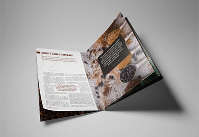
4. Expand Your Images to the Bleeds
It’s easier and easier to find high-quality images nowadays. So why not give your users the advantage of adding some visual weight to your template? Images play a big role in design, adding context and emotion. Add this to the content and you can communicate a message much more clearly. For the best impact, display images as full pages or even spreads to break up the visual repetition from page to page.
This InDesign cookbook template uses full-size images on single pages and spreads. This helps the InDesign page layout look luxurious and high end. So take advantage of your beautiful images and display them as much you can. If you are looking for amazing high-quality assets, check out Envato Elements and its ever-growing image library.

If you want to help your users make their photos look professional, try working with layers. Add an overlay over the images to convert them into monochrome or colorize them using the Effects panel. This will help achieve a cohesive look across the Adobe InDesign template, and users will have a professional-looking end product. This InDesign brochure template has a professional look throughout the layout by using black and white and yellow overlays.

Take a look at this InDesign trifold brochure template tutorial. This versatile pamphlet includes colored overlays on all the images to achieve an even look throughout the design.
-
BrochureHow to Make a Trifold Brochure Pamphlet Template

5. Go Dark
Legibility is a big part in a successful InDesign page layout. The overuse of dark colors on the interior pages tends to be avoided because of that specific issue. While dark colors can be tricky to work with, they can also be stylish and sophisticated.
It is unusual to see dark colors being used alone, so try adding a good contrasting color—either white on a black background or a dark blue/grey with orange. A pop of color can help highlight specific areas of the content, making it edgy and adding visual candy to the design.

Check out this beautiful dark blue InDesign book jacket template tutorial. It includes a handy diagram you can use for future reference for your own book jacket templates.
-
InDesign TemplatesHow to Create a Book Jacket Template in InDesign

6. Play With Type Scales
Enhance your design by adding contrasting typographical elements. Use large-scale typography sparingly, e.g. for quotes, section openers, or headlines. These pages will be a good visual treat as the users flip through the design.
Large type won’t only help you divide sections but will also create contrast on a spread. Avoid using large type size for long forms of text like copy—you still want readers to feel comfortable reading.
In the InDesign template below, big type is used in the form of a quote. It’s perfect for highlighting certain parts of the copy and giving readers a visual break.

As to which fonts are better to use at a large scale, try using sans serif. They tend to translate better from small to big scale. Check out the InDesign brochure below, in which the designer chose heavier weights, like bold or black. These families are designed to be used as display types because they are easier to read at a bigger scale. Last, make sure you are adjusting the tracking and kerning as these can look different at a bigger scale.

7. Frame With Borders
Amplify the theme of your template by adding a decorative element to the border of your design template. Menu templates are one of the few pieces you can add some personality to. Depending on the restaurant you have in mind when creating a template, you can add something suitable to the theme. Choose a simple stroke to go around the menu to frame the content. In the InDesign menu template below, the window-like frame helps enhance the content and theme of the menu.

In this other InDesign menu template, the designer used a more fun and whimsical border. The polka-dot pattern is light and airy, so it won’t conflict with the content in the menu. You can extend the pattern to the opposite side of the menu to create a cover page too.

Use the following InDesign menu template tutorial as inspiration. The border is a beautiful illustration of seafood, enhancing the theme of the menu.
-
Adobe InDesignHow to Make a Restaurant Menu Template in InDesign

8. Type Over Images
Gone are the days when we used to divide images from content. Thankfully, we’ve figured out how to layer these two in harmony and create a more intriguing InDesign page layout.
In order to make this work, use a contrasting image as a background. Layer it up with a contrasting color for the copy, and you are set. Try to divide the content into blocks, so that the details don’t disappear in the image—as in the InDesign flyer template below. Using white type over a dark image lends a dramatic look. Add a pop of color to sections to highlight details.

If you are using an image with intricate forms as a background, stick to using white type and keep the layout simple. Create texture by using the different font families in a font, and you’ll get a clean look. Make sure the fonts that you use are extra legible. Choose a large x-height font because its openness will make it easier to read.
Check out the center page of the InDesign brochure template below. The layout is kept as a clean one-column, but it is enhanced by the different font families used on the content. Sleek!

Take a look at this stylish InDesign catalog template. This lookbook features a beautiful play of type and images throughout the design.
-
Adobe InDesignHow to Make an InDesign Catalog Template

9. Break the Grid
Grids are an essential part of layout design. They provide a solid foundation that determines the position of all the elements and ultimately creates a balanced layout. Grids aren’t only used to create clean layouts; they can also be used for experimental pieces.
We’ve seen many examples based on specific grid structures, and there’s nothing wrong with this. You’ll be surprised to know that experimental layouts are also based on grid structures. Try layering your design over a grid instead of pushing elements as you would puzzle pieces. Layer type over images, images over basic colored shapes, and you’ll create a great sense of depth. Don’t get carried away with layering—when things start to look busy, allow some white space to come through. White space can help emphasize the focus in a template.
This InDesign catalog template uses multiple layers to display all the elements. Yet it looks clean, professional, and sleek. Keep the color palette minimal and let the layers do all the work!

Check out this beginner InDesign portfolio template tutorial to create a layering style layout:
-
InDesign TemplatesHow to Make Stylish Layouts for a Portfolio Template in InDesign

Placeit
If you are new to design and don’t know how to get started, a great online option is Placeit. Placeit is one of the fastest-growing mockup generators. With hundreds of options to choose from, you are sure to find something that suits your needs.
Placeit offers a great library with stock images along with their templates. It is easy to use, and you can create designs as easily as filling out a form. Add your logo, copy, and image. Browse through the different fonts and extensive image library as you design your flyer.

Conclusion
Today, we looked at nine tips and tricks to enhance your Adobe InDesign template. If you are ready to start creating your own InDesign templates, we know it can be daunting trying to figure it all out. We looked at tips ranging from basic grid structures to typographic texture, basic shapes, and image impact. These key elements will help you set yourself apart from the crowd and create eye-catching templates that will have your users coming back for more.
If you are new to InDesign and need an InDesign page layout or InDesign ebook template right away, head over to Envato Elements and GraphicRiver. We’ve got many options to explore!
If you liked this tutorial, you might like these:
-
ResumesHow to Make a Resume Template in InDesign (With Free Template Download)
-
Print DesignHow to Change Page Size in InDesign
-
BrochureHow to Make a Brochure
-
InDesign TemplatesHow to Make a Booklet in InDesign
-
InDesign TemplatesHow to Make an InDesign Book Template (Cover & Layout)
-
Flyers42 Best InDesign Template Tutorials
-
TemplatesHow to Make an InDesign Presentation Template
-
InDesign TemplatesHow to Create Layout Templates in InDesign (for Magazines, Newsletters, and More!)


First posted here: Envato Tuts+ Tutorials
Hope you valued the info that they shared. You’ll find matching articles on our website: https://www.designmysite1st.com/
Let me have your views down below, leave a quick comment and let me know which topics you want us to cover in future blog posts.